The brand had a solid foundation but was stretched thin across too many touchpoints. Event pages, emails and social posts each looked a little different, and the core palette didn’t have the range to carry modern digital content. The brief was to bring everything under one consistent, contemporary look without losing the brand’s recognizable identity.
The result
From trade show pages to inboxes to LinkedIn feeds, every touchpoint now speaks the same visual language. The original colors and typography stay at the core, while an expanded palette and new graphic shapes give the brand room to feel fresh across photo, video and digital.
Photography
0+
Video
0+
Email campaigns
0+
Our approach
Kept the original colors and fonts as the foundation, then expanded the system with supporting colors and a new set of graphic shapes.
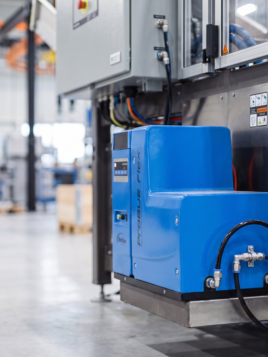
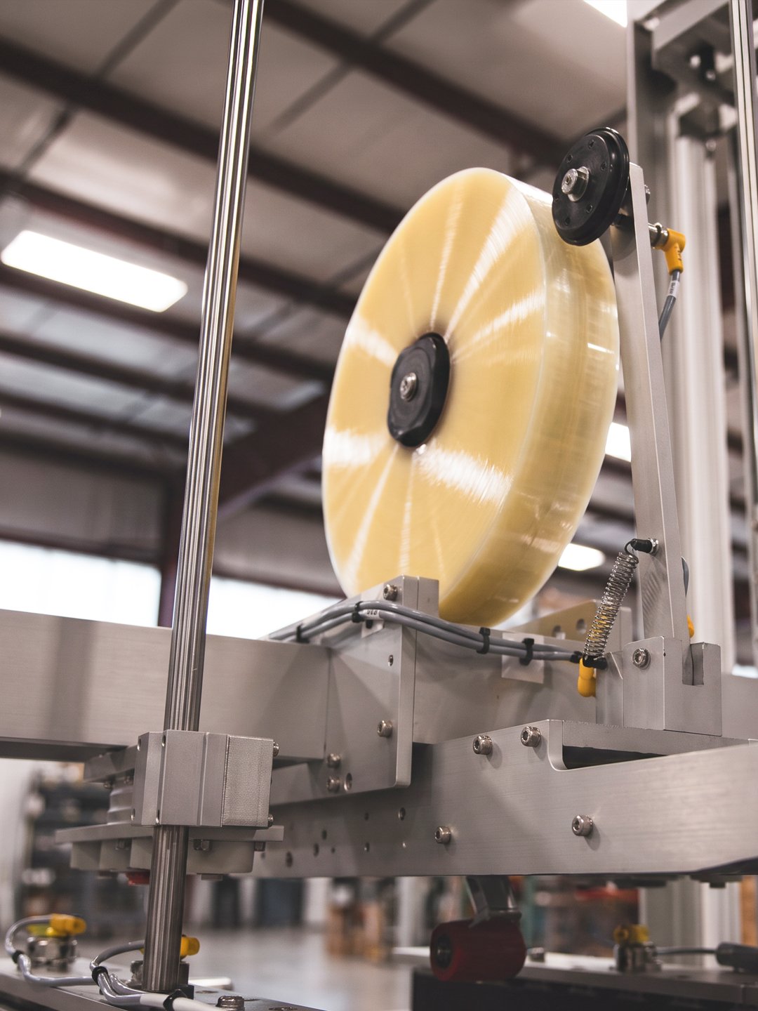
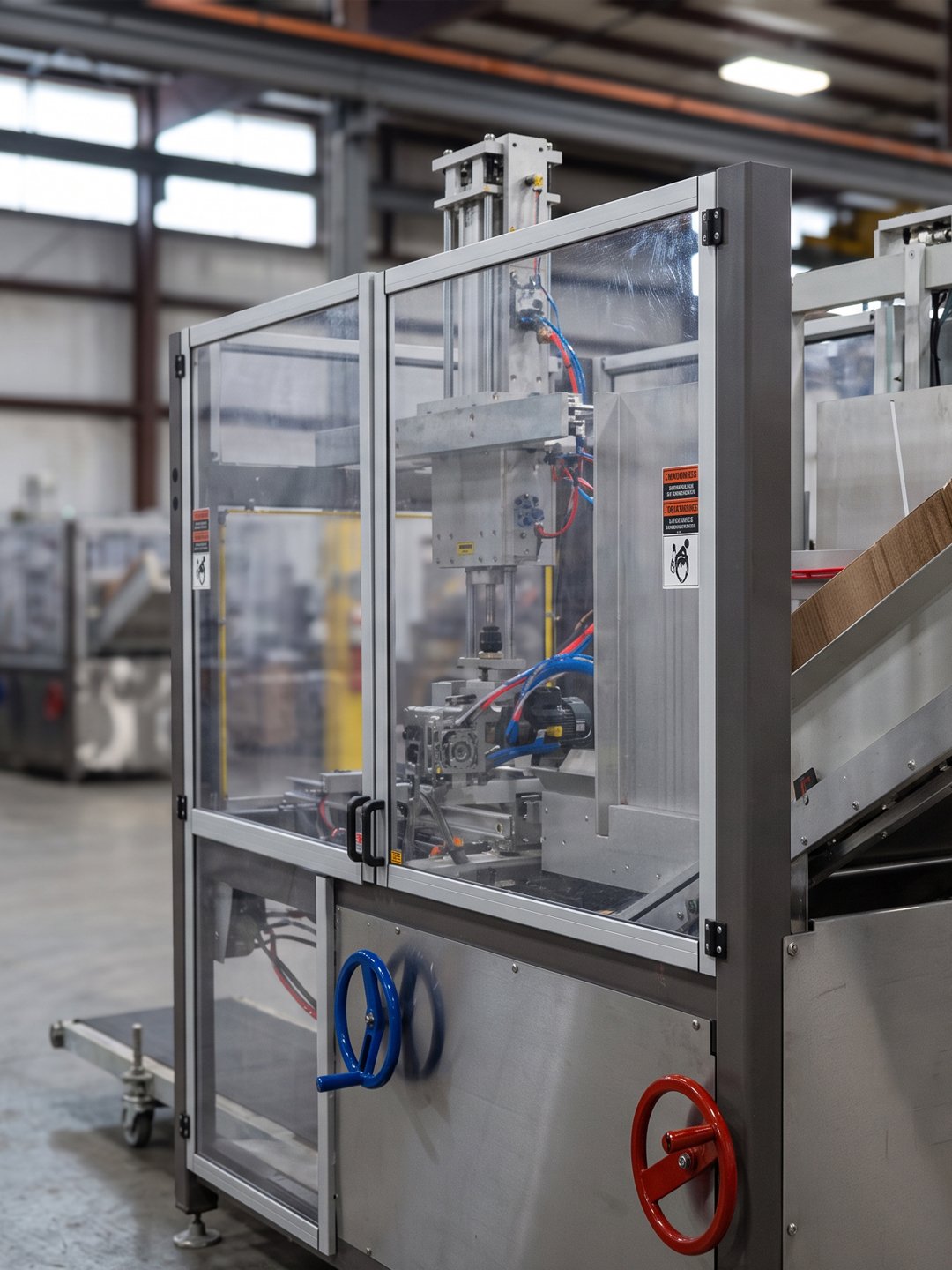
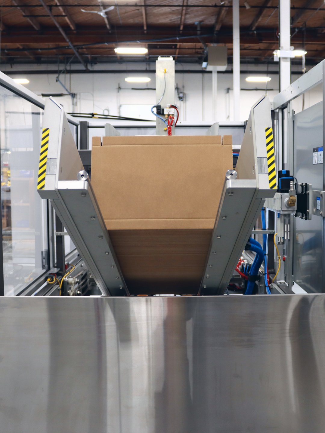
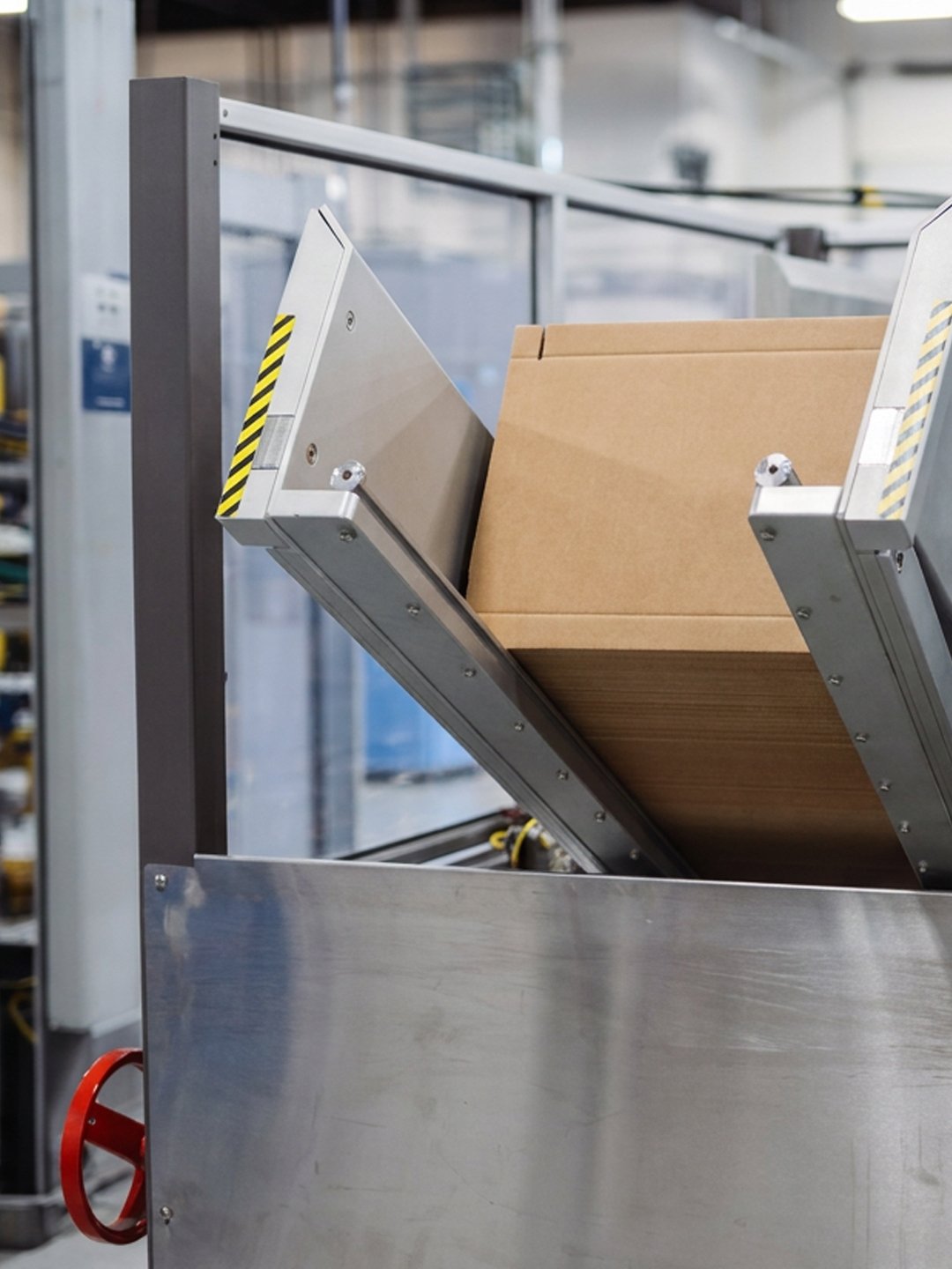
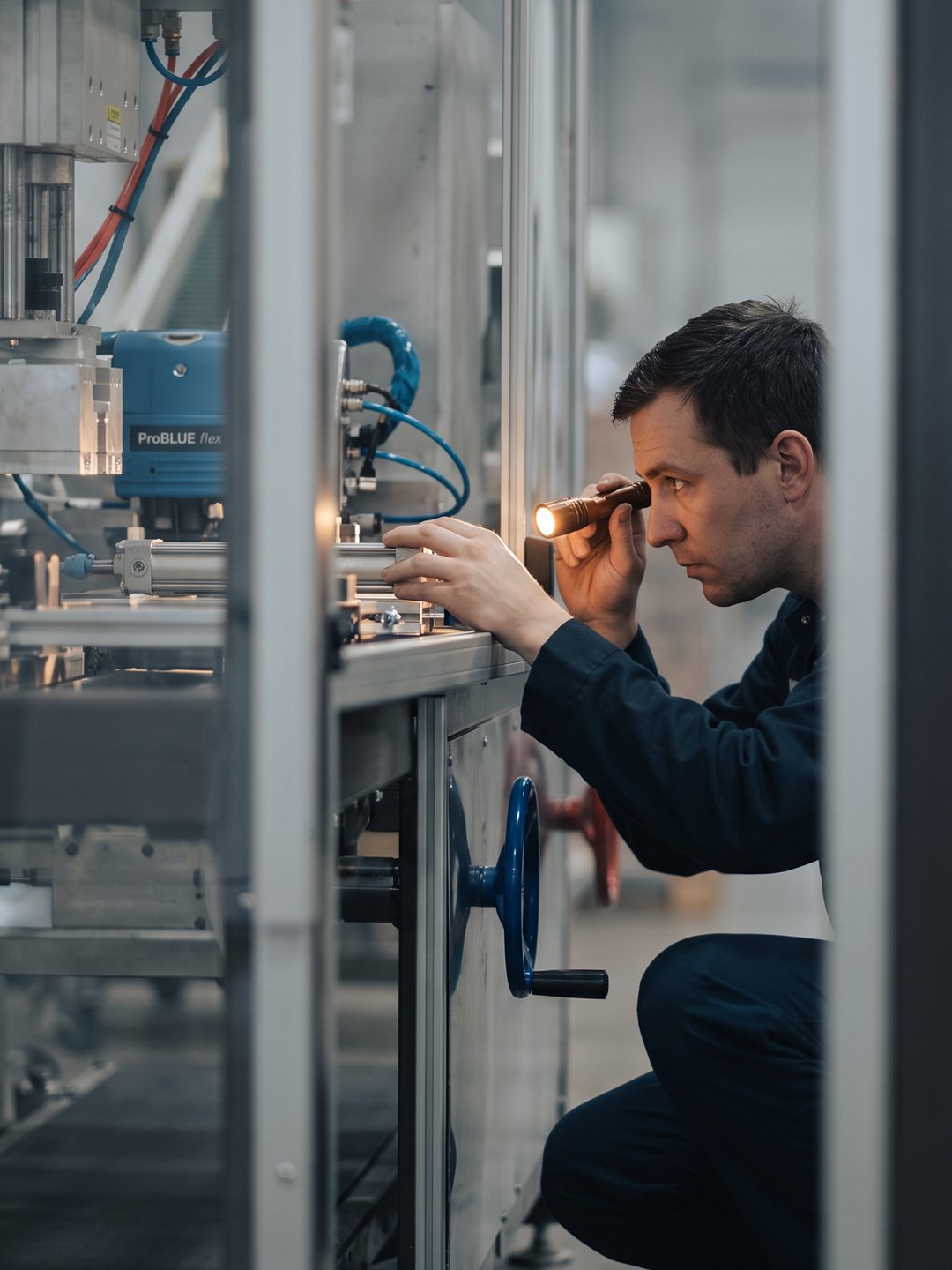
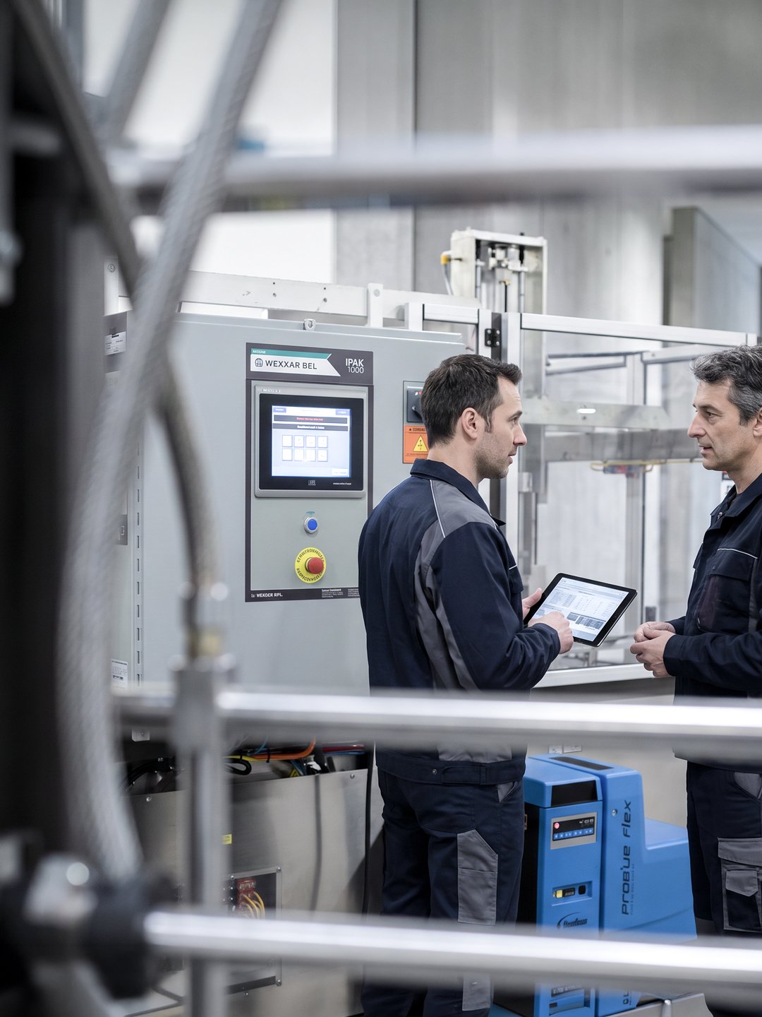
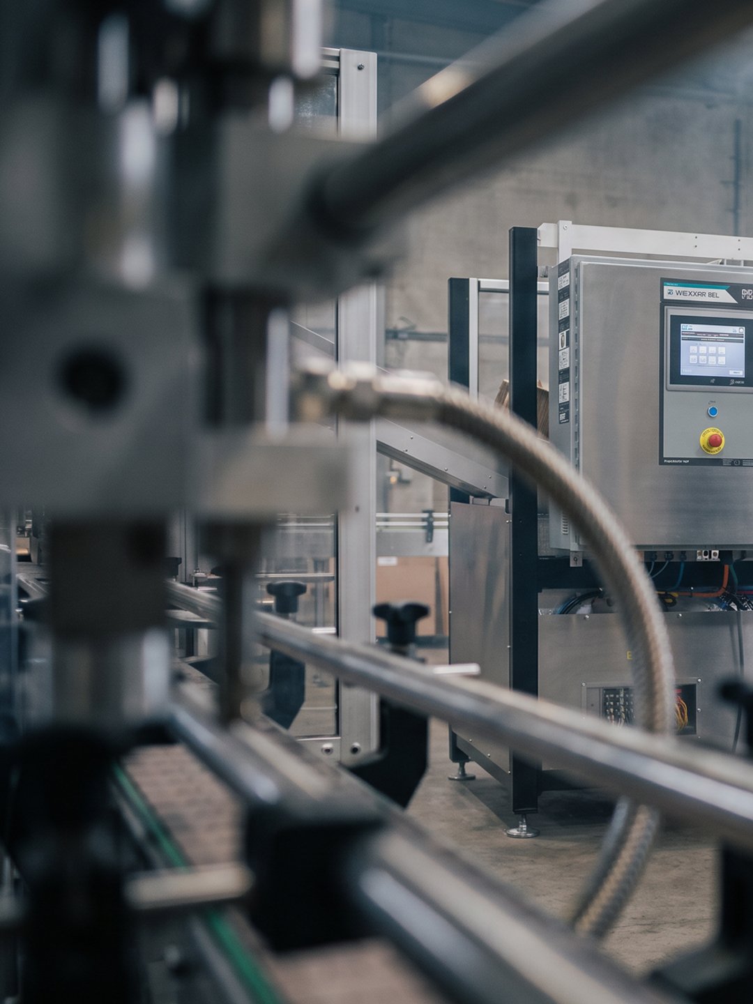
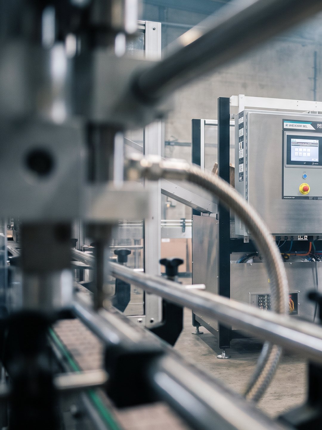
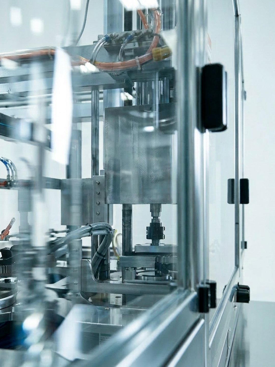
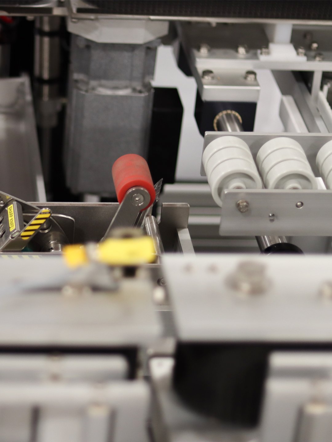
Produced photo and video content that shows complex machinery clearly and makes it look sharp.
Redesigned the event webpages and email communication to be cleaner, consistent and on-brand.
Built social media templates so every post stays on-brand and is quick to produce.